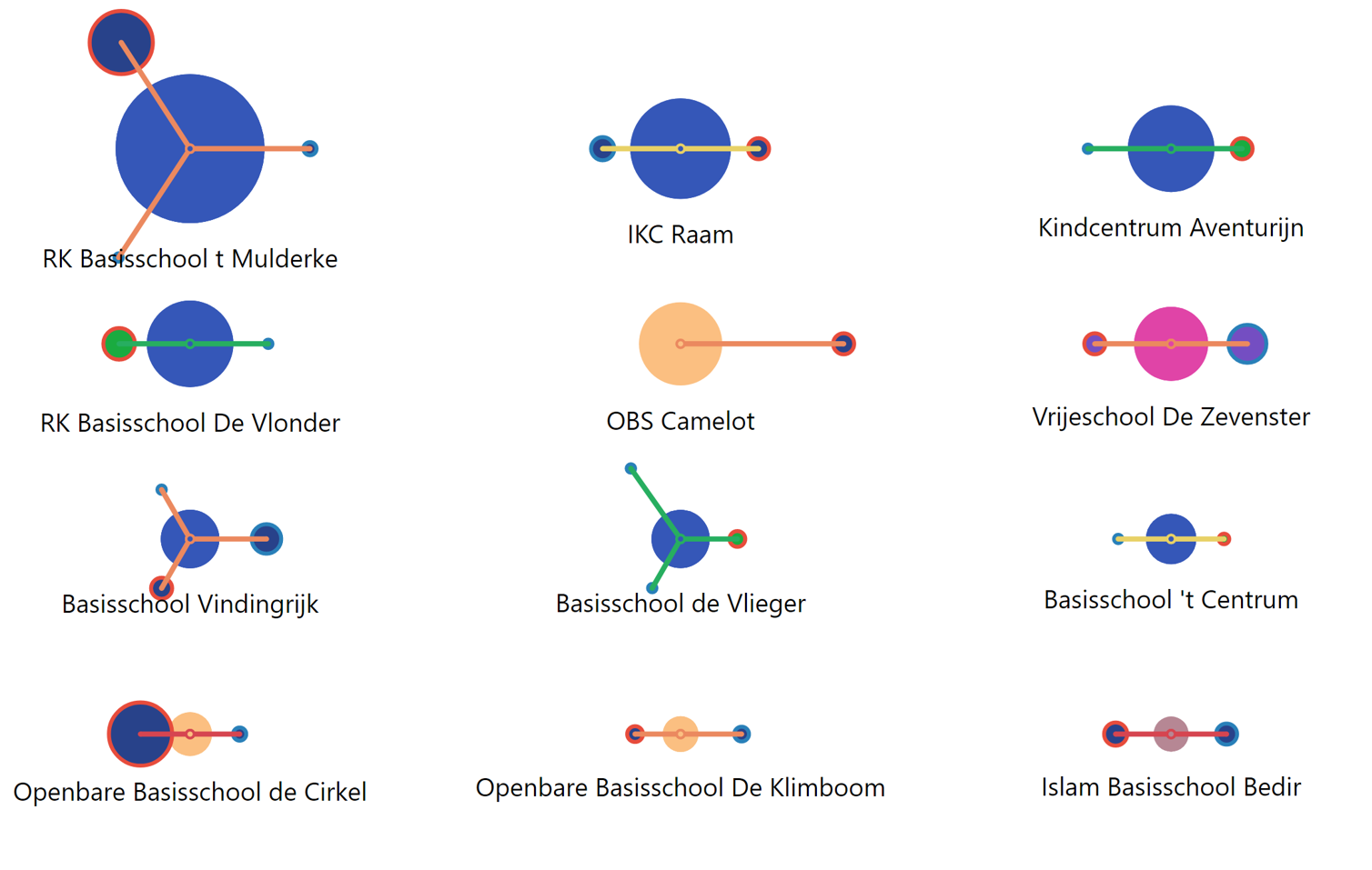
Proximity Bubble Map Visual
Choose the right day care for a school
A Bubble Chart that represented Schools and nearby Day Care Centres as Bubbles. The visual lets the user to analyse and decide the best Day Care Centre for any School based on various properties embedded in the visual. The size of the bubble depicts the capacity, the colour of the stroke depicts the type, and the colour of the link depicts the strength of the relationship between a School and a Day Care Centre. The key functionalities are:
- Dynamic Positioning - The visual dynamically fits in the N number of schools that exist in the dataset, and also positions the Day Care centers around the school based on coordinates
- Relationship - The color of the link depicts the strength of the relationsip between a School and Day Care. The length of the link gives an idea of the distance from the School
- Capacity indicator - The size of the bubble depicts the capacity
- Completely Customizable - Plenty of formatting options to control the width and height of every element, along with text customization